


A high-converting landing page helps visitors understand an offer, recognise its value, and take a specific action, such as booking a consultation, requesting a quote, or making a purchase. Effective landing page design combines clear messaging, persuasive calls to action, fast loading speeds, mobile usability, and trust-building elements to reduce friction throughout the conversion journey.
A landing page should not simply look attractive. It must align the visitor’s expectations with a relevant solution and make the next step easy. Businesses can improve results by reviewing each part of the page systematically, identifying obstacles, and testing improvements using real performance data.
Whether you are promoting a service, launching a product, or collecting qualified leads, this landing page design checklist will help you build an experience that supports measurable business outcomes. Companies that need additional design expertise may choose to hire website designer professionals who understand user experience, conversion optimisation, and responsive layouts. Others may work with a freelance website designer or outsource web design to access specialised skills without expanding their internal team.
What Makes a Landing Page Convert?
A landing page converts when it helps the right visitor understand an offer and complete the intended action with minimal confusion. Conversion does not depend on one design element alone. It results from the relationship between the audience, advertising message, page content, visual hierarchy, credibility, and user experience.
For example, a visitor clicking an advertisement for a free business consultation expects to find information about the consultation, an explanation of its value, and a straightforward booking process. If the page instead presents a generic company introduction and several unrelated services, the visitor may leave without converting.
The strongest landing pages focus on one primary objective. Their headlines communicate a clear benefit, supporting content addresses customer concerns, and calls to action explain what visitors should do next.
Before designing a page, define the target audience, traffic source, main offer, and conversion goal. A landing page for paid advertising may need a different structure from one designed for organic search traffic. Understanding these differences creates a stronger foundation for every design decision.
1. Create a Clear, Benefit-Driven Headline
The headline is often the first substantial piece of information visitors notice. It should immediately explain what the offer provides and why it matters to the intended audience.
Avoid vague statements such as “Welcome to Our Website” or “Your Trusted Business Partner.” Although these phrases may sound professional, they do little to distinguish the offer or communicate a concrete benefit.
Instead, focus on the visitor’s desired outcome. A business offering website optimisation might use a headline that emphasises improving website performance and generating more qualified enquiries.
The headline should also match the advertisement, email, or search result that brought visitors to the page. If the original message promises a specific service or offer, the landing page must deliver on that expectation.
A supporting subheading can explain how the offer works, who it serves, or what makes it different. Keep both elements concise enough to understand quickly, particularly on mobile screens.
2. Make the Value Proposition Immediately Obvious
Visitors should not have to search through several paragraphs to understand why they should choose your product or service.
Your value proposition should explain the problem you solve, the audience you help, and the meaningful benefit your offer provides. It should also communicate a relevant point of differentiation, such as a specialised process, convenient delivery, transparent pricing, or a clearly defined service scope.
Avoid relying exclusively on broad claims such as “industry-leading solutions” or “exceptional quality.” These statements are difficult to evaluate unless they are supported by specific information.
For example, a web design agency could explain how its process combines responsive layouts, user research, and conversion-focused testing to create more effective customer journeys.
A strong value proposition helps visitors determine whether the offer is relevant to them. It also establishes the context for the supporting content, testimonials, and calls to action that follow.
3. Use a Prominent and Specific Call to Action
The call to action (CTA) tells visitors what to do next. It should be visually noticeable, easy to understand, and consistent with the offer.
Buttons such as “Book Your Consultation,” “Request a Quote,” or “Get Your Free Assessment” communicate a clearer next step than generic labels such as “Submit” or “Click Here.”
Place the primary CTA where visitors can find it without unnecessary effort. Depending on the page length, it may appear near the headline, after the main benefits, and near the final conversion section.
Avoid presenting several competing primary actions at the same time. If a landing page encourages visitors to book a call, download a guide, explore multiple services, and follow several social accounts, attention can become fragmented.
Secondary actions may still be useful, but they should not distract from the main conversion goal. Test CTA wording, placement, and surrounding content to understand which combination performs best.
4. Build a Logical Visual Hierarchy
Visual hierarchy guides visitors through the information in the order that matters most. Headlines, subheadings, images, buttons, and supporting text should work together rather than compete for attention.
Use typography, spacing, contrast, and alignment to distinguish important elements. Keep paragraphs readable, separate related sections, and avoid placing too many decorative elements around the primary CTA.
A useful page structure might introduce the offer, explain its benefits, demonstrate credibility, address common objections, and finish with a clear conversion opportunity.
Images should support the message rather than simply fill space. Product screenshots, service illustrations, authentic photographs, and relevant demonstrations can help visitors understand what they are considering.
When businesses hire web designer professionals, they should look for designers who can explain how layout decisions support user behaviour. Visual appeal is important, but each element should have a purpose within the conversion journey.
5. Add Credible Testimonials and Social Proof
Visitors may hesitate to take action when they are unfamiliar with a company or uncertain about the quality of its services. Credible social proof can reduce that uncertainty by demonstrating that other customers have had relevant experiences with the business.
Depending on the offer, useful evidence may include genuine testimonials, verified reviews, relevant case studies, client feedback, or documented results. Each item should be accurate and presented with appropriate permission.
Specific testimonials are often more informative than vague praise. A customer explaining what problem they faced, how the service helped, and what changed afterwards gives prospective buyers a clearer picture of the experience.
If you use performance statistics, explain what they represent and avoid implying that every customer will achieve the same outcome. Unsupported claims can damage trust and create compliance concerns.
Do not invent customer logos, reviews, certifications, or endorsements. Trust elements are effective only when visitors can reasonably rely on them.

6. Explain Your Offer and Remove Uncertainty
Visitors often leave landing pages because they cannot determine what is included, how the process works, or what happens after submitting a form.
Use a dedicated section to explain the offer in straightforward language. For a service, this might include the scope of work, key deliverables, typical process, relevant limitations, and the next steps after an enquiry.
Pricing information can also help when it is appropriate for the business model. If pricing depends on project requirements, explain the factors that influence cost rather than leaving visitors with no guidance.
Frequently asked questions can address common objections about timelines, eligibility, support, payment, or implementation. Keep answers concise and relevant to the decision visitors need to make.
The goal is to reduce uncertainty without overwhelming the page with unnecessary information. Prioritise the questions that genuinely influence whether someone feels comfortable taking the next step.
7. Use Relevant, High-Quality Visuals
Images and videos can help visitors understand an offer more quickly, but irrelevant visuals can weaken the message. Choose media that supports the page’s purpose and reflects the actual product, service, or customer experience.
For software, screenshots or short demonstrations may be more useful than decorative stock photography. For a professional service, relevant project examples or authentic team photographs may establish credibility more effectively.
Optimise image dimensions and file sizes to prevent visual assets from slowing down the page. Use appropriate formats, responsive image delivery, and lazy loading for below-the-fold media when suitable.
Avoid autoplay videos with sound, distracting animations, or excessive motion that interferes with reading. Every visual element should help explain the offer, establish trust, or support the desired action.
8. Design for Mobile Visitors First
A landing page must remain easy to use on smaller screens. Mobile visitors may be navigating with one hand, using slower connections, or viewing the page while distracted.
Check that the headline fits comfortably, buttons are easy to tap, forms are manageable, and important information is not hidden behind awkward layouts. Navigation and pop-ups should not obstruct the primary action.
Avoid forcing visitors to zoom in to read text or scroll horizontally to view content. Make sure images resize correctly and that columns stack in a logical order.
Test the complete conversion process on actual mobile devices where possible. A page can look responsive but still contain difficult form fields, broken dropdowns, or buttons that do not work reliably.
Review mobile performance separately from desktop performance because the two experiences can differ considerably.

9. Improve Page Loading Speed
Slow pages can interrupt the conversion journey before visitors even see the offer. Large images, unnecessary scripts, excessive tracking tools, and poorly configured hosting can all contribute to performance problems.
Start by measuring the page using appropriate performance tools. Review image optimisation, caching, script execution, font loading, and unnecessary third-party integrations.
Monitor Core Web Vitals, including Largest Contentful Paint, Interaction to Next Paint, and Cumulative Layout Shift. These measurements help assess loading performance, responsiveness, and visual stability.
Avoid adding multiple pop-up tools, chat widgets, and tracking scripts without evaluating their value. Each additional component can increase complexity and affect performance.
A faster page does not automatically guarantee higher conversions, but reducing unnecessary delays removes a common source of friction and supports a more dependable user experience.
10. Keep Forms Short and Relevant
Forms are often the final step between a visitor and a conversion. Asking for unnecessary information can discourage people from completing the process.
For a basic consultation request, a name, business email, and one relevant qualifying question may be sufficient. More complex services may require additional details, but every field should have a clear purpose.
Consider whether information can be collected later during a conversation instead of demanding it immediately. If a form needs several fields, group related questions logically and provide clear labels.
Explain what happens after submission. Visitors should know whether they will receive an email, schedule a call, or be contacted by a team member.
Test form validation, error messages, confirmation pages, and mobile usability. Ensure that submissions reach the appropriate team and that conversion tracking records successful completions rather than simply button clicks.
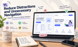
11. Reduce Distractions and Unnecessary Navigation
A dedicated landing page often performs best when it keeps attention focused on one primary goal. Unlike a general website page, it may not need a full navigation menu linking to every service, blog category, and company resource.
However, removing all navigation is not always the right choice. Visitors may need access to privacy information, important service details, or other pages that establish credibility.
Choose the structure according to the audience and conversion objective. For a focused paid campaign, minimising unrelated links may help visitors stay on task. For a high-consideration service, additional supporting information may be essential.
The important principle is intentional design. Every link, button, and interactive feature should help visitors make a decision or complete the desired action.
12. Track the Right Performance Metrics
A landing page should be evaluated using metrics that reflect its actual purpose. Depending on the campaign, these may include conversion rate, qualified leads, completed purchases, cost per acquisition, revenue per visitor, or appointment bookings.
A high conversion rate does not necessarily indicate success if the leads are unsuitable or the resulting sales revenue is low. For service businesses, tracking lead quality and progression through the sales pipeline provides a more complete picture.
Use analytics to identify where visitors arrive, how they interact with the page, and where they abandon the conversion process. Check that tracking is configured correctly and respects applicable consent requirements.
Compare performance by device, traffic source, and campaign where enough data is available. This helps reveal whether a problem is related to the page itself or to a particular audience or acquisition channel.
13. Run A/B Tests Before Making Major Changes
A/B testing compares two versions of a page to determine which performs better against a predefined objective. You might test a benefit-focused headline against a feature-focused headline or compare a shorter form with a longer one.
Begin with a clear hypothesis and select one primary metric. Where possible, change one major variable at a time so the results are easier to interpret.
Ensure the test receives enough traffic to produce meaningful evidence. Avoid declaring a winner after a handful of conversions, and account for factors such as campaign changes, seasonality, and differences in audience composition.
Use the results to guide the next experiment. If a shorter form improves completion rates, investigate whether it also maintains lead quality. Continuous optimisation should balance conversion volume with the value of the resulting customers.
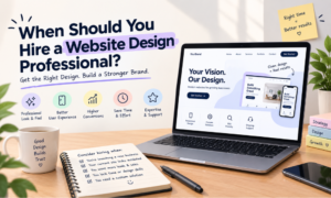
When Should You Hire a Website Design Professional?
Some businesses can improve a simple landing page using existing templates and in-house resources. More complex campaigns may benefit from professional expertise in user research, responsive design, analytics, accessibility, and conversion optimisation.
When you hire website designer professionals, review their portfolio and ask how they approach page structure, messaging, usability testing, and performance measurement. Look for evidence that they understand business objectives rather than focusing exclusively on visual presentation.
A freelance website designer may be suitable for a focused campaign, a new service landing page, or a small set of design improvements. Before starting, agree on deliverables, revisions, implementation responsibilities, and how success will be evaluated.
Businesses with broader requirements may outsource web design to an agency that can coordinate design, development, and testing. This arrangement can be helpful when several landing pages, integrations, and marketing campaigns must work together.
A website design outsource strategy should include clear communication, documented requirements, ownership of design files, and an agreed quality assurance process. Outsourcing does not remove the need for internal oversight; the business still needs to approve messaging, confirm brand accuracy, and review conversion results.
The best partner is one who can translate customer needs into a practical design and improve the experience using evidence rather than assumptions.
Conclusion
Use this checklist to review each part of your landing page before launch, then continue improving it through analytics, customer feedback, and controlled experiments. Avoid assuming that a particular colour, headline, or layout will work for every audience; measure results and adapt the experience to actual visitor behaviour.
Whether you hire web designer talent, partner with a freelance website designer, or outsource web design to an agency, keep conversion goals at the centre of the process. For businesses working with Your Cloud Hub, a structured approach to landing page design can help connect a better user experience with stronger lead quality, more meaningful engagement, and sustainable digital growth.